The Daily report turns a search in the Mail Log Tracker into a measurement.
The result table answers « which messages? »; the report answers « how many, when, and with what outcome? »
over the whole period, as a chart, a table and a CSV file.See also daily report by e-mail
¶ Why it matters
- It counts in the database, not on screen.
The result table displays the most recent 200 matches;
the report aggregates every matching message over the period.
On a domain sending thousands of messages a day, counting the visible rows would not merely be tedious — it would be wrong.
- It cannot disagree with the table.
The report is built on exactly the same search criteria as the list behind it.
There is one definition of « the messages of that customer last week », not two.
- An empty slot is a measured zero.
Hours or days with no traffic appear as zero, not as a gap in the curve.
A hole would read as a missing measurement — the exact opposite of « nothing was sent ».
- It is evidence you can hand over.
The CSV export carries the period, the granularity and every bucket, ready to attach to a ticket, a customer report or an audit answer.
- Failures are part of the picture.
Sent, deferred, bounced and rejected mail are counted side by side, so a volume that looks healthy but is half bouncing cannot pass for a good day.
¶ Producing a report
The Daily report button sits in the search bar, next to Search and Clear. It stays disabled until at least one filter is set, and its tooltip says so:

This is deliberate.
A report is a measurement of something: a domain, a sender, a client IP, a time window.
Without a single criterion there is no subject to measure, only the total traffic of the appliance — which the SMTP statistics pages already present.
Type a filter and the button becomes available immediately; no need to run the search first.
¶ The period
The report always states the period it covers, on its first line, resolved to the second:
- With dates — the report covers exactly the From date / To Date range of the search.
- Without dates — it covers the last 24 hours.
It is never the whole history: an unbounded report would be slow to build and almost never what was meant.
The stated period is the one that was measured. If it is not the one you wanted, correct the dates and produce the report again.
¶ Granularity: hourly or daily
The report chooses the size of its buckets from the length of the period:
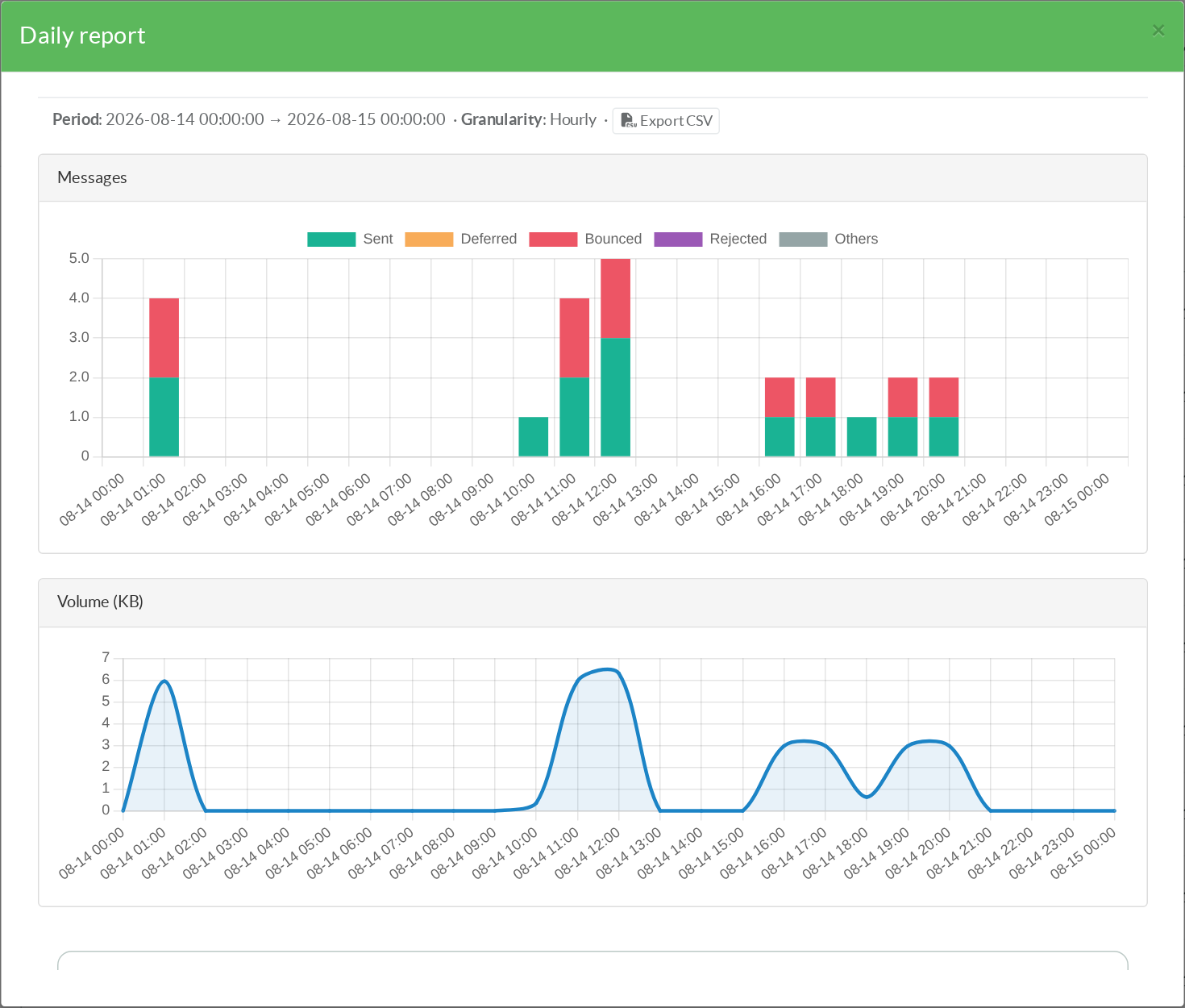
- up to 48 hours → one point per hour;
- beyond → one point per day.
The choice is shown next to the period, as Hourly or Daily.
It is automatic because neither setting is right at both ends: a day grouped by day is a single bar, and three months grouped by hour is two thousand unreadable points.
To move from one to the other, widen or narrow the dates.
¶ The charts
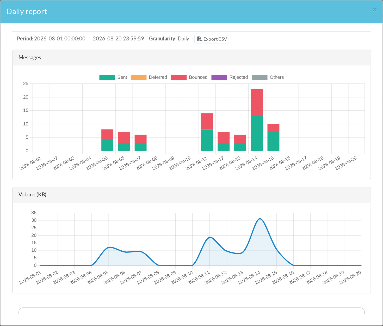
The first chart stacks the outcome of every message in the bucket, so the height of a bar is the total traffic and its composition is the quality of that traffic:
- Sent — accepted by the next hop.
- Deferred — temporarily failed, still being retried.
- Bounced — permanently failed, returned to the sender. Expired messages are counted here.
- Rejected — refused during the SMTP session, before ever being queued.
- Others — messages still in flight at the time of measurement (received, queued, being delivered). They are neither a success nor a failure, and are deliberately not counted as either.
The second chart plots the volume in kilobytes over the same buckets. Message count and volume tell different stories: a hundred newsletters and a single large attachment do not load a relay in the same way, and only the volume curve shows it.
¶ The table and the totals
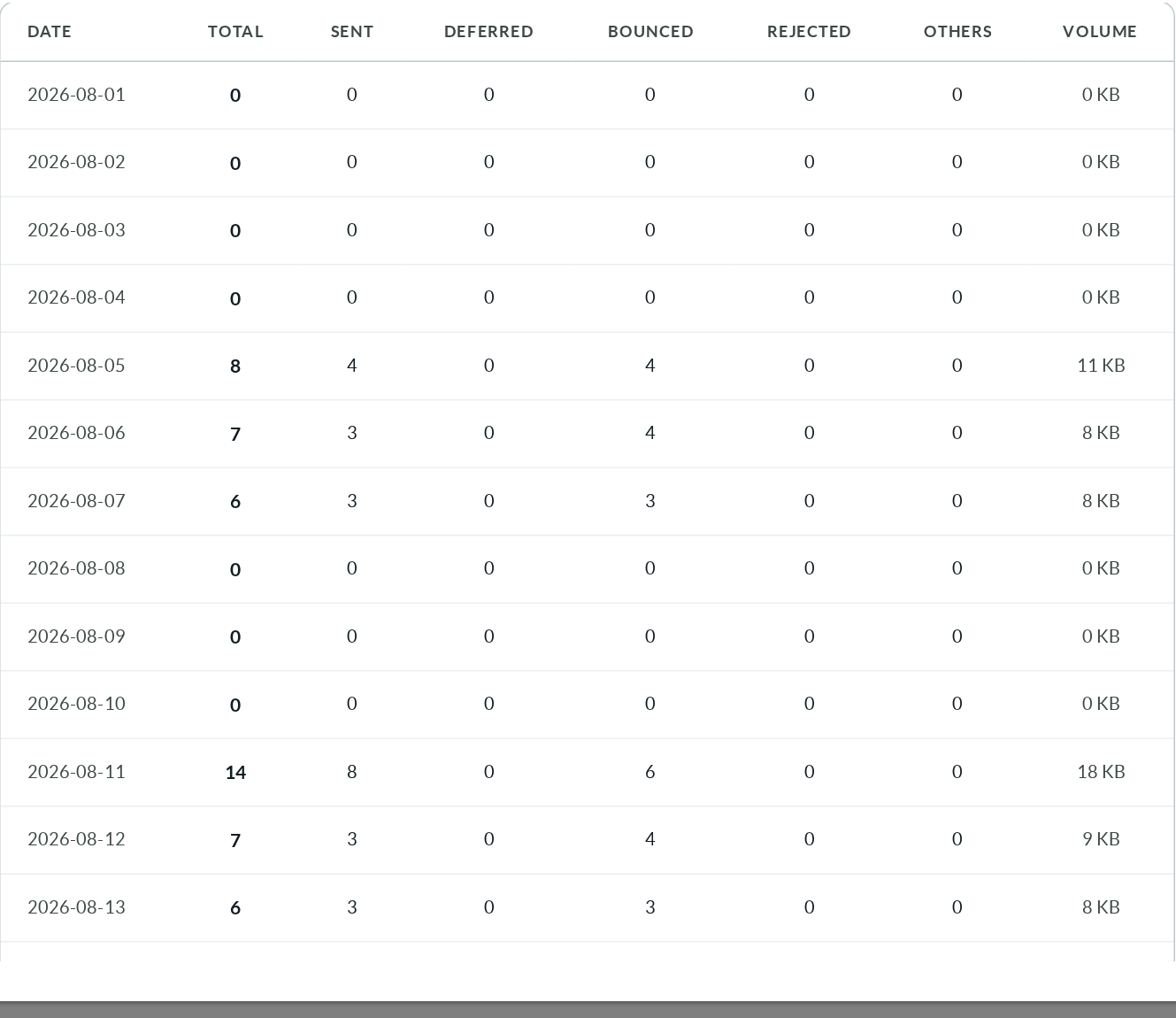
Below the charts, the same figures as a table:
- one row per bucket,
- one column per outcome,
- plus the volume
- and a Totals row closing the period.
The table is where you read exact numbers; the charts are where you see the shape.
¶ CSV export
The Export CSV link, next to the period, downloads the table as it stands, for the same filters.
The file starts with the metadata that makes it self-describing months later:
period_from,2026-08-19T17:20:20 period_to,2026-08-20T17:20:20 granularity,hour date,total,sent,deferred,bounced,rejected,other,bytes 2026-08-19T17:00:00,0,0,0,0,0,0,0 2026-08-19T18:00:00,12,11,0,1,0,0,184320 … TOTAL,81,44,0,37,0,0,111368
Volumes are exported in bytes and timestamps in ISO 8601, so the file can be summed or charted in a spreadsheet without reinterpreting anything.
¶ When rejected messages are counted
Rejected (NOQUEUE) messages are counted alongside delivered ones — but only when the filters allow it.
A rejection happens before the message is queued, so it carries no queue ID, no delivery status, no relay and no DSN code.
If you filter on one of those, the rejections that match the remaining criteria are a different population, and adding them would inflate the report with events your filter excluded.
In that case the report says so instead of quietly changing what it counts:
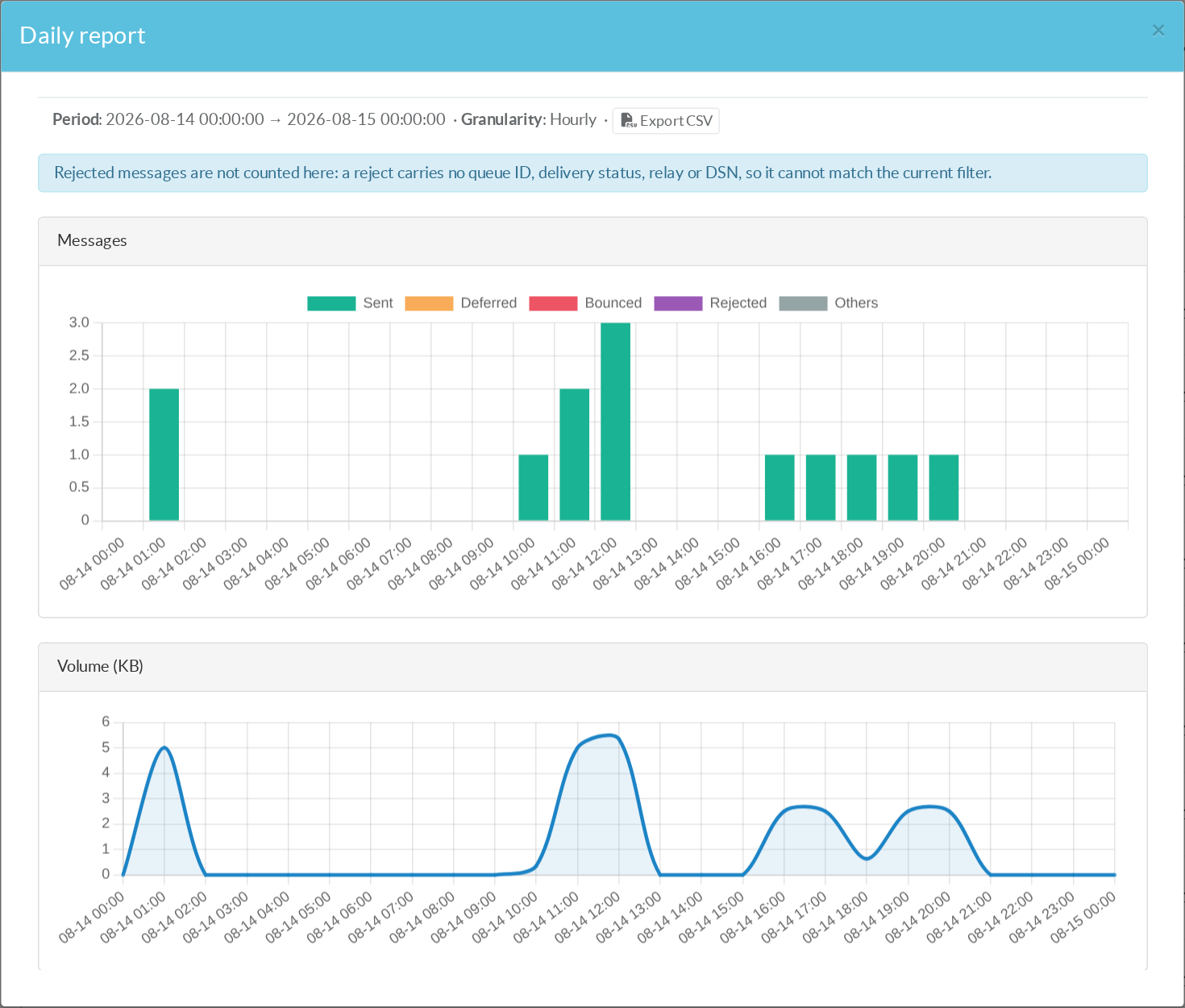
To include rejections again, filter only on criteria a rejection can carry: recipient, sender, client IP and dates.
¶ Very long periods
A report is limited to 750 buckets — roughly two years of daily points. Past that the series is cut, and a warning states it.
The warning matters more than the limit: a truncated chart that said nothing would read as a period during which nothing happened.
¶ Typical use cases
- Monthly report for a customer domain.
Filter on the sender domain, set the month, export the CSV: volume, successes and failures per day, ready to attach.
- Proving the extent of an incident.
Filter on the affected relay's recipients over the incident window with hourly granularity:
the report shows when deferrals started, how many messages were affected, and when delivery resumed.
- Watching a newly onboarded sender.
A new application starts relaying through the appliance:
the daily curve shows whether its volume is what was announced, and the bounce share whether its address list is clean.
- Capacity planning.
Volume in kilobytes per day over a quarter says more about the load to size for than a message count does.
- Answering « are we being attacked? »
Filter on a client IP:
a wall of Rejected with almost no Sent is a source being turned away, and the report quantifies it.
- Checking a deliverability change.
After enabling DKIM, a new relay or a blocklist, compare the bounce share before and after over the same span.
¶ Notes
- The report is computed on demand and stores nothing. Producing it repeatedly costs nothing but the query.
- Timestamps are displayed in UTC, consistently with the rest of the tracker.
- Statuses are counted as they stand at the moment of measurement: a message still being retried counts as Deferred, and will count as Sent or Bounced in a report produced after it settles.
- The report covers only the period the tracker actually recorded. If its ingestion dropped events under load — visible in Statistics on the tracker page — the figures for that period are a lower bound.