Every HTTP request passing through your reverse proxy is classified, counted, and visualized in real time.
You see exactly what your infrastructure is doing, right now, and how it has behaved over time.This feature is available on Artica v4.50 Service Pack 7 or Artica v4.50 Service Pack 6 Hotfix 20260212-21
¶ Global Overview
- Click on
Web Services > Statistics - The Global Statistics dashboard aggregates data across all published websites into a single unified view
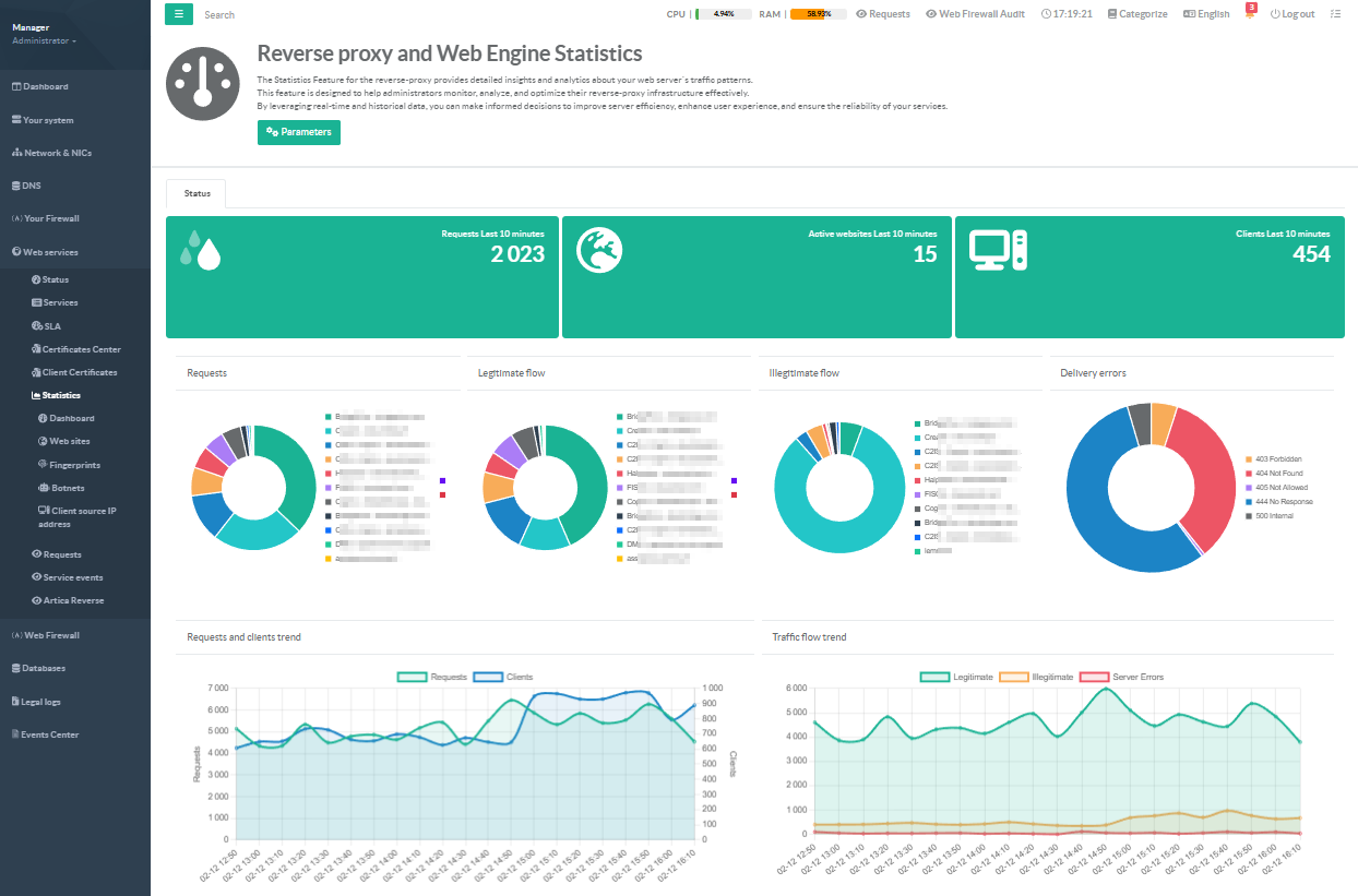
4 Doughnut Charts — Instantly understand the composition of your traffic:
- Requests
Which websites receive the most traffic?
Spot imbalance before it becomes an outage.
- Legitimate Flow
Per-site breakdown of clean, successful requests (2xx/3xx).
Confirm your applications are serving users correctly.
- Illegitimate Flow
Per-site breakdown of blocked, rejected, or malicious requests (4xx client errors, 444 silent drops, 429 rate-limits).
Identify which sites are under attack or misconfigured.
- Delivery Errors
Granular HTTP error code breakdown (400, 401, 403, 404, 405, 408, 429, 444, 499, 500, 502, 503, 504).
Pinpoint exactly which error codes are affecting your infrastructure.
When all traffic is clean, a reassuring green "No Errors" indicator confirms your services are healthy.
2 Trend Line Charts — Track evolution over time:
- Requests & Clients Trend:
Dual-axis chart correlating total request volume with unique client IPs.
Detect traffic spikes, DDoS ramp-ups, or organic growth.
- Traffic Flow Trend
Stacked area chart showing legitimate vs. illegitimate vs. server error flows side by side.
See security incidents unfold and confirm mitigation in real time.
¶ Per-Website Deep Dive
The Website Statistics page lets you drill into any individual published website
- A button lists every active website by name.
Select any site and its complete analytics.
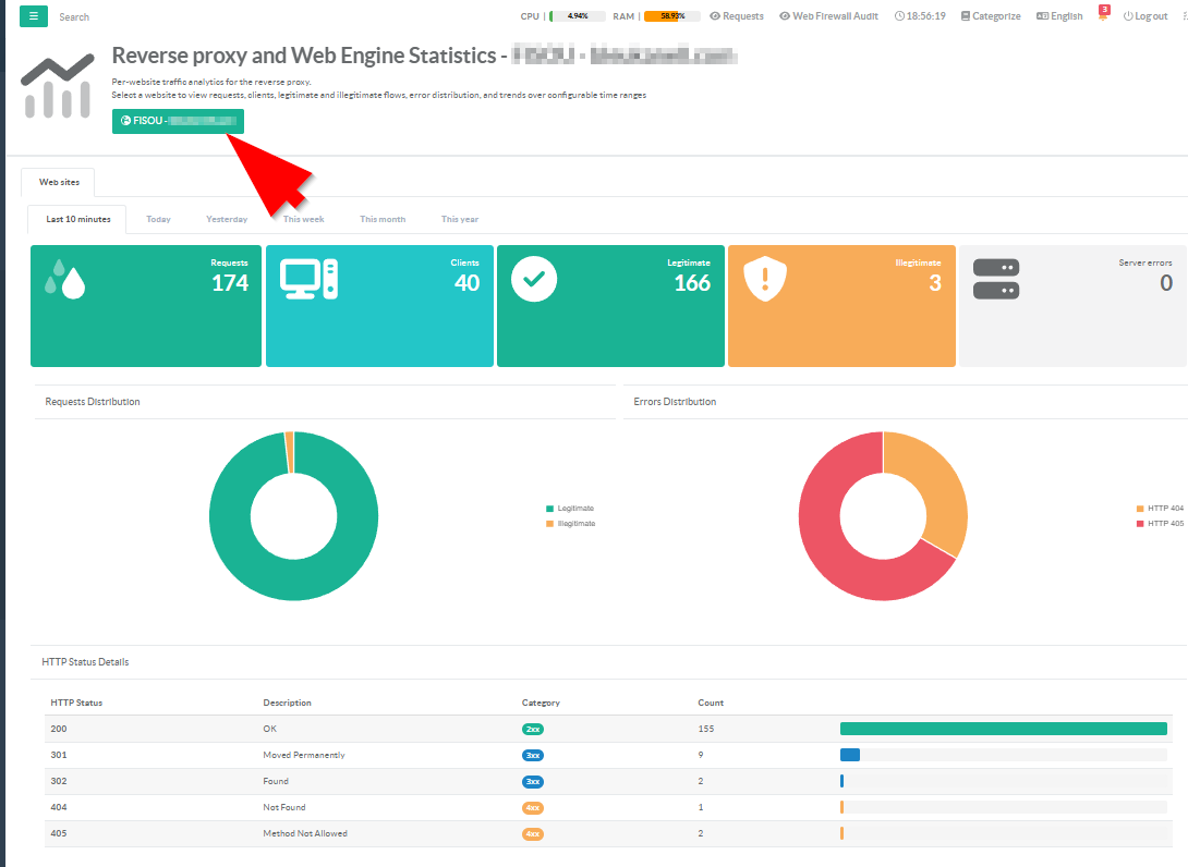
- 6 Time Range Perspectives
Analyze each website across six configurable time windows- Last 10 Minutes
Real-time snapshot Is the site healthy right now? - Today 10-minute intervals
How has traffic evolved since midnight? - Yesterday 10-minute intervals
Compare against today's baseline - This Week 10-minute intervals
Detect day-of-week patterns - This Month
Hourly aggregates Capacity planning and trend analysis - This Year
Hourly aggregates Long-term growth and seasonal patterns
- Last 10 Minutes
¶ 5 KPI Widgets
Color-coded counters provide instant status:
- Requests (navy)
Total HTTP requests processed - Clients (cyan)
Unique client IP addresses - Legitimate (green)
Clean traffic successfully served - Illegitimate (yellow)
Blocked or rejected requests - Server Errors (red)
Backend failures (5xx responses)
Widgets turn gray when a metric is zero, providing immediate visual confirmation that a category has no activity.